Go behind the scenes of The 1975’s ambitious ‘At Their Very Best’ tour
Designer Tobias Rylander on how he worked with The 1975 to create the most impressive live show of the last year
By Nick Reilly

The designer behind The 1975’s ‘At Their Very Best’ tour has opened up on how he worked with the band to bring their latest widely acclaimed production to life.
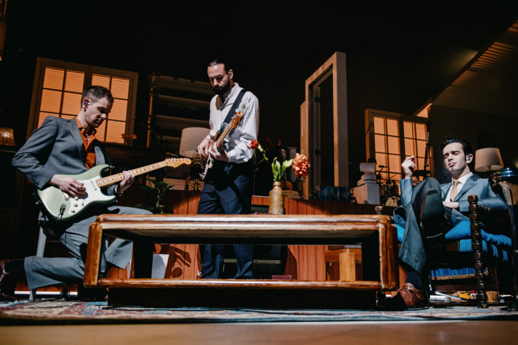
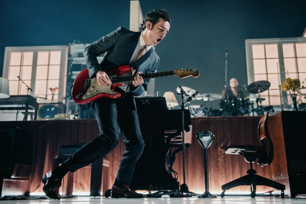
The shows, which kicked off in North America last autumn, see the group perform on a sprawling set comprised of a house across two floors. While it gives the impression of a cosy family sitcom from the 1990s, that illusion is shattered at various points through the show as frontman Matty Healy’s antics, which offer a surreal take on modern masculinity, become increasingly bizarre.
The design is the brainchild of designer Tobias Rylander, a long-term creative collaborator of the band who is also responsible for their 2019 world tour and the conceptual vision behind their ‘Love It If We Made It’ video.
“When it came to this tour, the first thing that Matthew [Healy] told me was that it had to be about the band,” explained Rylander.
“From there, we kind of discussed what we had been doing that was *not* about the band. I’ve been working for Matthew for 10 years and one of his mottos has been that when you’re a rock star, you’re recognisable by your silhouette. This time we didn’t want to create silhouettes or video screens or layers of lights to hide behind.”
The result was a house lit in white like a theatre production, which was a huge contrast from the bright LED screens and lights that have defined the band’s previous shows. Rylander explained that further inspiration emerged when he looked at the imagery defining the band’s latest album, 2022’s Being Funny In A Foreign Language.
“One of the key ideas was to bring that campaign onstage, which is something I always try to do. I look at the colour scheme and what is going on in the album campaign and album artwork. This time, there was a lot of beautiful black and white photography. I started there and thought of it as being a continuous film of the video and the album artwork.”

As for the house itself – the defining feature of the show – Rylander said that it was of the utmost importance that the on-stage abode could be familiar and relatable for audiences at shows across the globe.
“I visited the band in the studio to discuss what they wanted and after we’d settled on the idea of a house, we kept coming back to the reference of Stanley Kubrick movies where you have these like suburban streets with with a lot of like houses that could be anywhere in the world and like any city in the UK. It’s also why it’s monochromatic colours; the house is presented in a plain kind of way that means audiences can kind of project their own memories onto it.”
As previously mentioned, the show takes a strange turn at several junctures during the first half of the show. We see Healy eat raw steak at one point (a moment that went viral online after being debuted during the band’s US tour), while at others he pretends to masturbate and delivers 20 press-ups in immediate succession. It comes to a climax with a clever illusion that sees Healy climb through a TV screen.
“Matthew is always very clear on the concept behind the tour,” explained Rylander.
“On the last tour it was about how we live under the weight of screen time and information and essentially the weight of technology. But this time, it’s much more about the content that we’re actually consuming. People across the world are obsessed with Andrew Tate and Joe Rogan and they just consume these podcasts or YouTube videos as if they’re totally real.”
Healy climbing into the television, Rylander explained, was the ultimate manifestation of this.
“We knew we wanted the TVs because I wanted them as lighting sources and they’re a very natural object in anyone’s home, they are the centrepiece of the house. But when we started to space them out in the house, we just came up with the idea that he is literally getting absorbed by TV and the things he’s watching.”
And while the tour won’t go on forever, the impact of its set will. The production has adopted a sustainable approach, which means that the set will go straight back onto the shelf of a design warehouse when the band conclude touring.
“We’re trying really hard to be sustainable in our designing and and how we do things,” added Rylander.
“The house and the framework of the house, the skeleton of the houses, are all parts of a new modular system developed by [stage design company] PRG that basically means once we’re done with the tour it can go back on the shelf and they can build other set pieces and video frames or whatever they want to do with it. Just a couple of years ago, every design on a tour would always be kind of grinded down or melted down or burnt. Now, we’re all about using it again.”
The 1975 play Finsbury Park on 2 July this summer.
