Three artists reinterpret David Bowie’s iconic ‘Ziggy Stardust’ album art
To celebrate 50 years of ‘Ziggy Stardust & the Spiders from Mars’ – on what would be the Starman’s 75th birthday – three visual artists reimagined the album cover using Adobe’s new Bowie-inspired digitised tools
By Brit Dawson

In partnership with Adobe
Dressed in shimmering jumpsuits of various colours and materials — the band in metallic velour and David Bowie in a geometric quilt — Ziggy Stardust and the Spiders from Mars landed on Earth in July 1972, touching down, coincidentally, on Top of the Pops. As he strummed his electric blue guitar and sang the first “hey la-la”s of “Starman”, a new Bowie era was born — one that skyrocketed the musician and his ever-evolving alter egos, quite literally, into the stars.
But Ziggy — an omnisexual alien rock star — didn’t just play guitar. He was a glamorous, exorbitant character, whose messiah-like following, bright red mullet, otherworldly make-up, and dazzling couture-esque costumes ushered in not only a new age of music, but also one of hopeful fantasy and unapologetic self-expression. But, by 1973 — having already cemented his legacy — it was time for Ziggy to retire (the character is said to have died as a result of his own fame and hedonistic excess).
Still, 50 years later and the Starman’s legacy lives on. The space-age alien is immortalised in art, film, TV, and music, and continues to influence both established and up-and-coming artists today. Among these artists are Reza Hasni, Brindha Kumar, and Imogen Crossland, who have collaborated with Adobe to reinterpret the artwork for Bowie’s fifth studio album, The Rise and Fall of Ziggy Stardust and the Spiders from Mars, in honour of its 50th anniversary this year (and what would be the musician’s 75th birthday).
To devise their illustrations, each artist utilised Adobe’s new Bowie-inspired digitised tools, which are available across a range of Creative Cloud apps and designed to facilitate other creatives’ self-expression — just as Bowie himself did. The toolkits consist of make-up brushes inspired by Bowie’s real cosmetic brushes, colours, and techniques, a pattern sampler, which lets users sample and rework the musician’s most famed costumes, brightly coloured backdrops and props, and stickers of archetypal Bowie imagery.
Here, Hasni, Kumar, and Crossland share their reworked Ziggy Stardust covers, discuss their process, and share what David Bowie means to them.

Reza Hasni
Reza Hasni is a Singapore-born, Berlin-based artist, whose works offer a contemporary reflection of the world and its unseen energies. Much like Bowie’s ever-transforming personas, Hasni says his artistic process centres on “construction, deconstruction, and rebirth”, which are all recurring themes in his work. Merging internet culture, club culture, and Asian spiritualism, Hasni’s brightly coloured, pop art illustrations are a psychedelic journey into another world — one that’s filled with faceless clowns and feet with faces, three-eyed aliens and dancing skeletons, and kaleidoscopic, hallucinatory patterns.
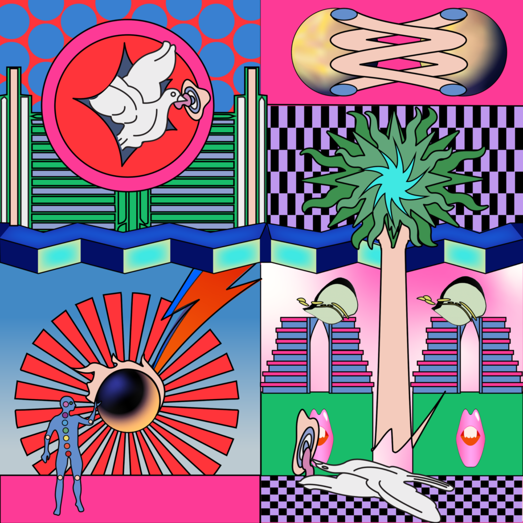
And his Ziggy Stardust offering is true to his mind-bending style. Divided into four distinct sections, Hasni’s reinterpretation is particularly inspired by “Starman”. With a bold palette of red, pink, green, blue, and purple, the artwork plays into the album’s space theme. There’s a blue, alien-esque figure lifting his hand up to Ziggy’s trademark gold astral sphere; a white dove carrying a mushroom floats through the sky, seemingly warping as he travels across the work; and a geometric staircase leading you out of this world and into another — one that’s probably just as gloriously weird.
“David Bowie is an inspiration to me and many others,” says Hasni. “He’s one of the most iconic artists of all time. When I was given the brief, ‘Starman’ just popped into my head, so I immediately followed that thought.” The artist says that as he listened to the track, he started “deconstructing and reconstructing it digitally”, before “drawing it out” and then using the Adobe tools to “enhance the design”. Among the tools Hasni used are the geometric patterns, which he describes as “very beautiful” and suited to his style, as well as cosmic stickers, brushes, and textures. “Those were really helpful, especially when you’re short of time,” he says. “Just simply drag and drop, and voilà, it’s done. The toolkit is super useful for new designers and those already working in the industry, [particularly] when you really need something beautiful, current, and quick.”

Brindha Kumar
“My illustration style [incorporates] the use of geometric symmetry, clean shapes, and lines, which centres around a tongue-in-cheek representation of modern and traditional society,” says London-based Malaysian illustrator Brindha Kumar. Her mesmerising illustrations traverse the everyday — still life portraits of bedrooms and serene holiday snaps — and the fantastical — technicolour robots of all shapes and sizes and an NFT series of butts. But it’s the latter that Kumar decided to draw on for her Ziggy Stardust artwork — the theme is out of this world, after all.
“My immediate idea was to create something otherworldly as a setting for Ziggy Stardust, who would take the stage as the obvious focal element: an androgynous rock and roll messiah reaching new spiritual heights through his music,” Kumar explains. “I was definitely heavily inspired by David Bowie himself for my creative design. I mean, who wouldn’t be? Looking at his old photographs, his fashion, style, make-up, and music — basically everything was just such a nice starting point for me to work from.”
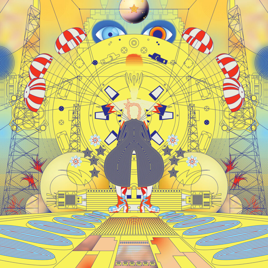
Bowie himself is the omphalos of Kumar’s reinterpretation, appearing in all his Ziggy glory: his bright red mullet, astral sphere, and historic black and white pantaloon jumpsuit. Against a vivid yellow backdrop, the musician appears to be standing on a stage — a literal larger-than-life figure — with several iterations of himself all around. To create the image, Kumar made ample use of Adobe’s Bowie colour palette — particularly red, orange, yellow, peach, and blue — and stickers. “What I like about the toolkit is that it has an array of special elements that really showcase and celebrate the life of Bowie,” reflects Kumar. “There’s a lot of colour vibrancy and movement that immediately jumps out at me, which is something I love because I use [colours] in heavy doses.”
“Bowie was a trailblazer and a huge influence to many over his constantly reimagined career,” adds Kumar. “And he did all this while being effortlessly himself.”

Imogen Crossland
Manchester-based Imogen (Imo) Crossland’s work is, as she calls it, “an ode to the good times”. Her Picasso-esque digital collages pop with pastel colours and breathe with life, painting a picturesque homage to parties, friendships, and the joy of living. Crossland’s abstract friends lounge in the park, sipping wine and gossiping; a group of girls lap up the serenity of reading together in silence; a loving couple embrace among the flowers. “They’re inspired by all the things I find beautiful,” says Crossland, adding that Bowie is one of them.
“He never stopped evolving,” she explains. “He was the master of reinvention and self expression. I think what I learned from Bowie is to never stop trying new things, and to get out of your comfort zone — don’t box yourself up and limit your practice.” Crossland says she wasn’t sure where to start when first reinterpreting Ziggy Stardust: “There’s just so much to pick from! But I did know that I wanted this piece to celebrate his eccentric and extravagant style.”
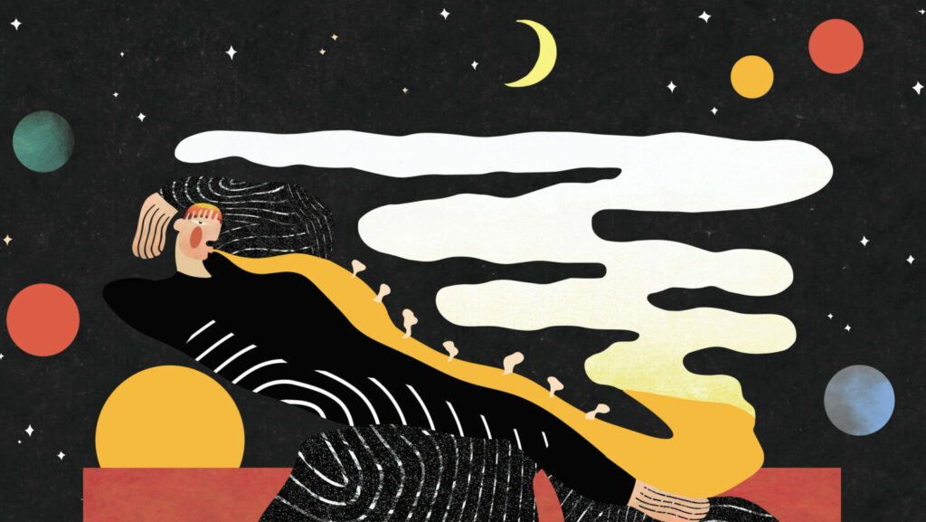
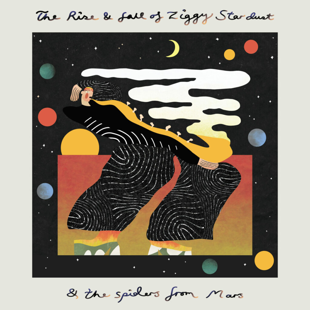
Crossland wanted to centre Bowie and his iconic pantsuit portrait. Toying with perspectives and shapes, Crossland’s dreamlike artwork depicts Ziggy in space, against a black, starry sky — as he leans backwards, he breathes light into the darkness. “I used a lot of the colour palette from the Adobe toolkit,” she adds, “reds, blues, and yellows — all the colours I think of when I think of Bowie. I also used the planet stickers and the Starman graphic, because it was designed after the pantsuit that I was using as my main source of inspiration.” Crossland says that the toolkit allowed her to “get really playful” with her collage, as it offered “so many different colours, shapes, and patterns”. She concludes: “I wanted to get the glam rock side of Bowie and this spacey, otherworldly style that he had — and it was great to have more elements and graphics to play around with [for this].”
